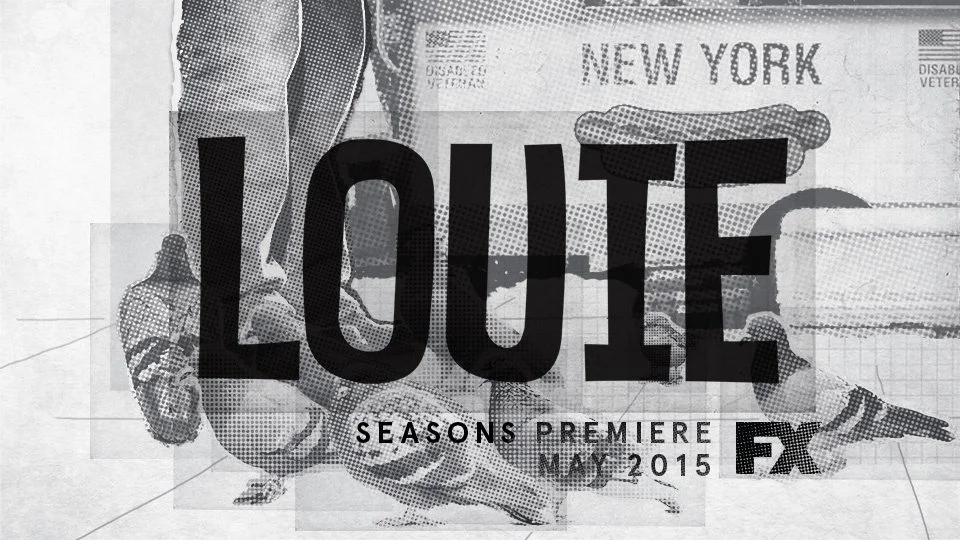
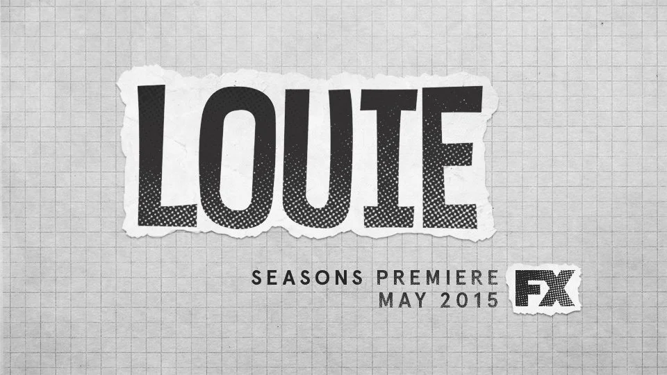
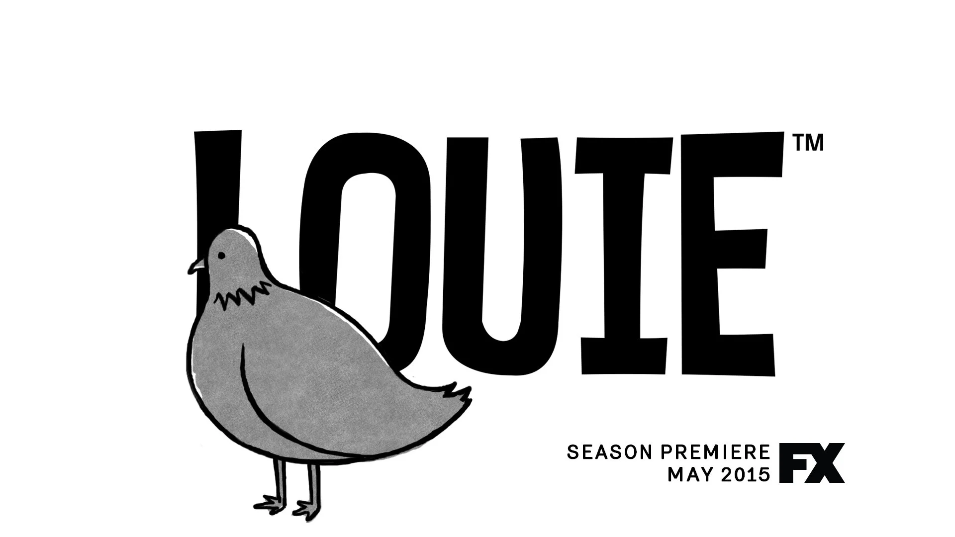
lOUIE
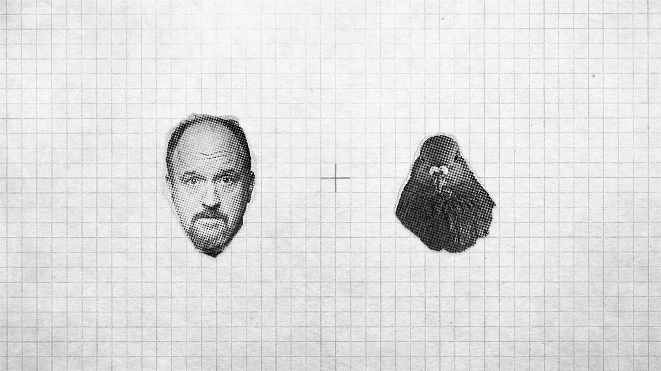
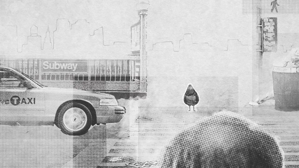
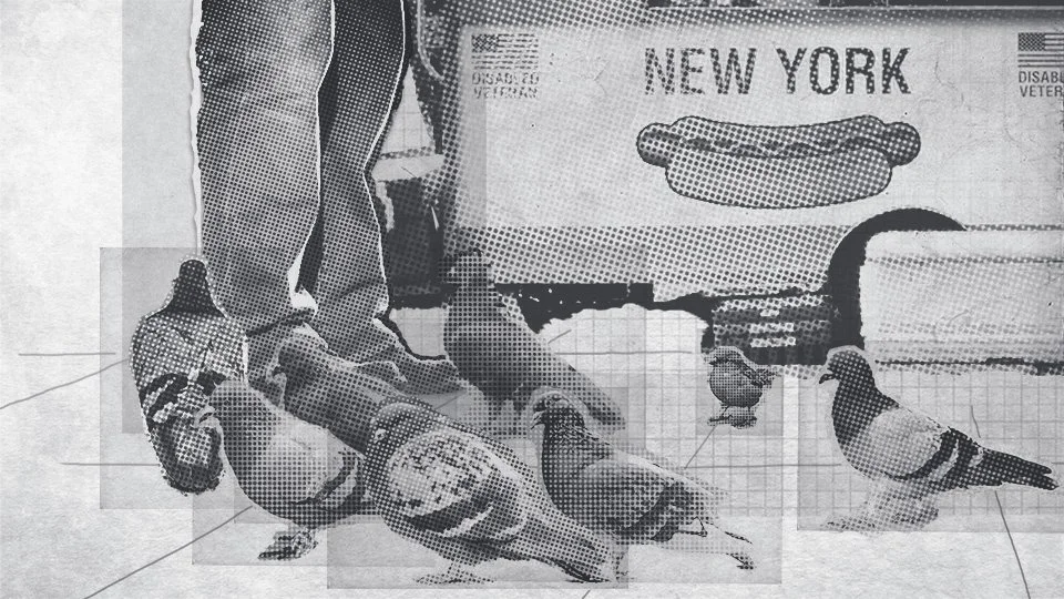
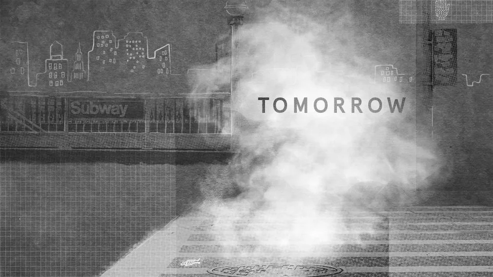
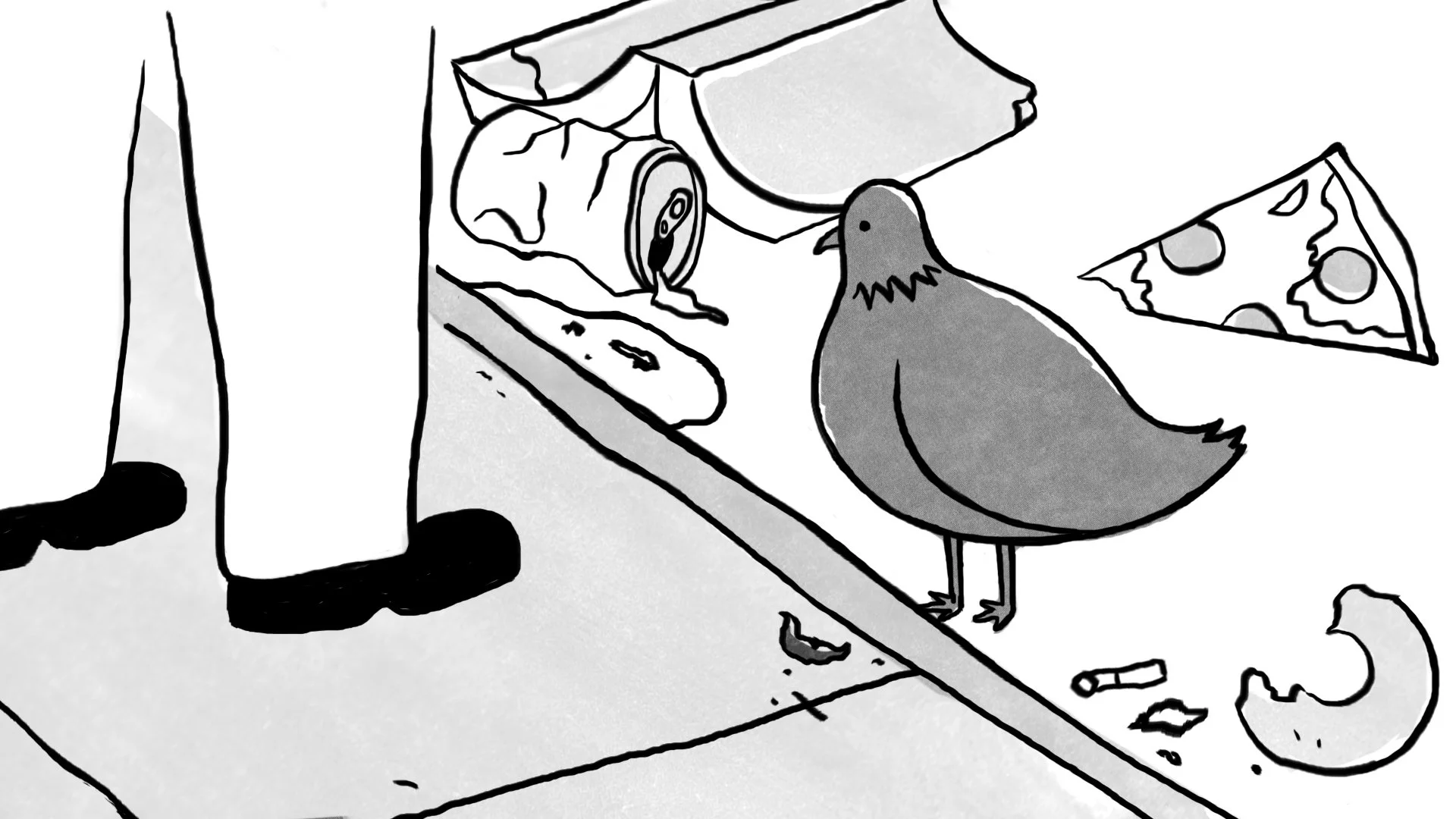
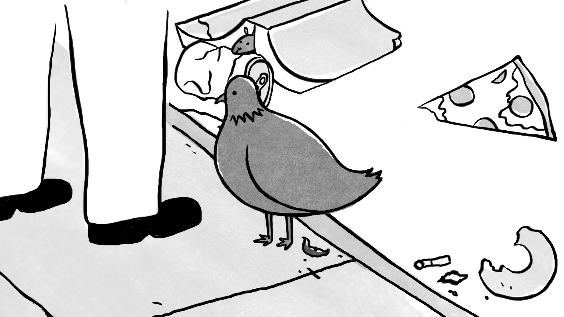
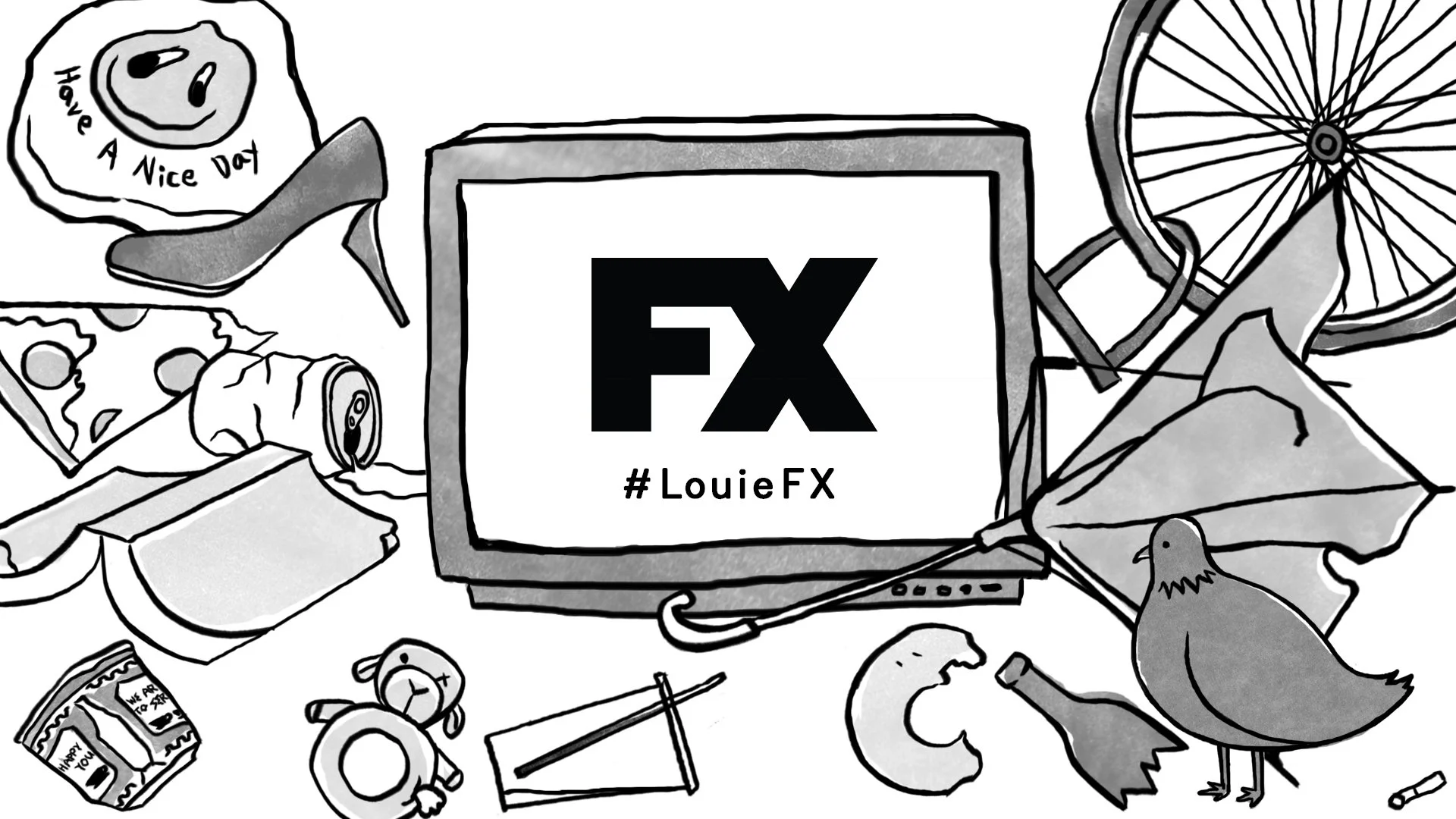
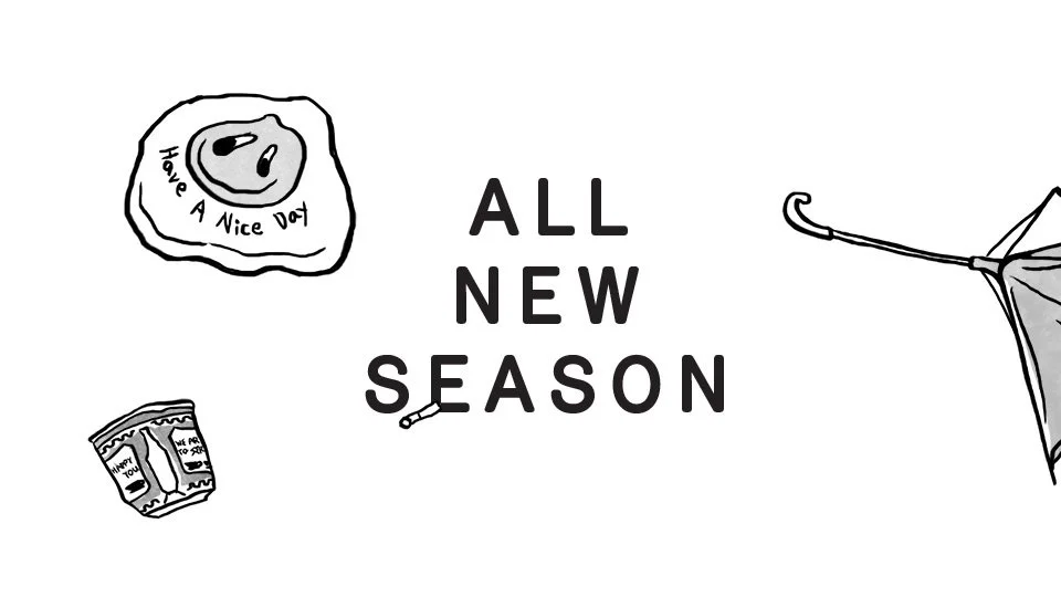
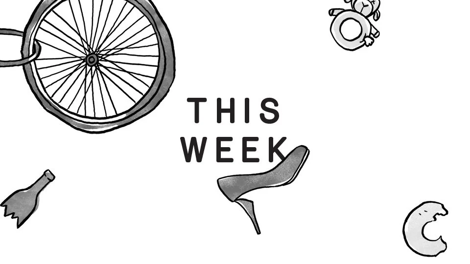
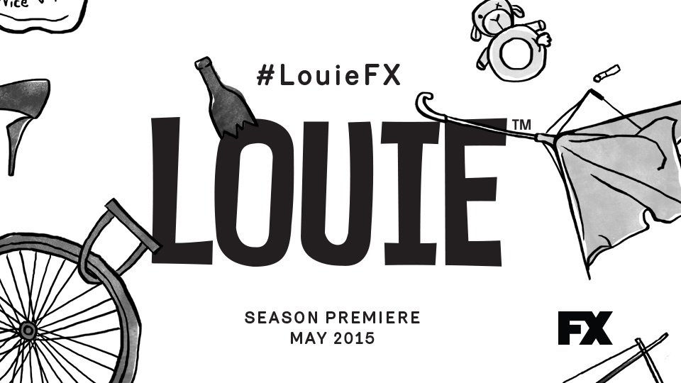
I designed style frames for my favorite TV Series, Louie’s(premiered on FX) new season pitch design. It was created based on the situation Louie might go through while walking on the streets of New York. I made it based on my own experience. I saw pigeons walking with New Yorkers on the streets of New York, waiting for a crosswalk and watching them cross. I thought these situations fit well with the theme of the Louie TV series, a black comedy. I tried two different styles. Concept 1 is a simple line drawing like New Yorker magazine cartoons. The second concept is the photography-based collage style.
제가 좋아하는 FX의 TV시리즈인 루이의 새 시즌 피치 디자인을 위해 스타일 프레임을 디자인했습니다. 루이가 뉴욕 거리를 걸으면서 겪게 될 상황을 모티브로 제작하였습니다. 컨셉의 스토리는 제 경험을 바탕으로 만들었습니다. 저는 뉴욕의 지저분한 길거리를 뉴요커들과 함께 자연스럽게 걷고 있는 비둘기들을 보았고,(진정한 뉴요커는 비둘기일 지도 모른다고 생각함) 횡단보도의 신호를 기다리고 있을 때 그들도 함께 신호를 기다리며 횡단보도를 건너는 것을 지켜보았습니다.(신호 상관없이 길을 건너는 뉴요커들보다 더 올바른 뉴요커라고 생각함) 이런 상황들이 블랙코미디인 루이 TV 시리즈의 주제와 잘 맞다고 생각했습니다. 디자인은 두 가지 다른 스타일을 시도했습니다. 컨셉 1은 뉴요커 매거진 만화처럼 심플한 라인 드로잉입니다. 두 번째 컨셉은 사진을 기반으로 한 콜라주 스타일입니다.
Client: FX
Production Company: DIA Studio
Creative Director: Mitchell Paone
Project Manager: Meg Donohoe
Art Direction & Design: Hyejin June Hong
Concept 1

Concept 2