Don't Panic Magazine
vol.32 City Pop
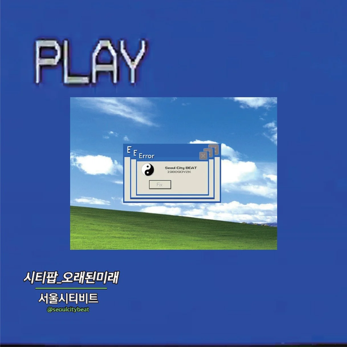
Don't Panic, a comprehensive culture magazine based in Bristol, UK, returned after a long hiatus with its Vol.32 City Pop issue, designed under the theme of "Designing the Old Future."
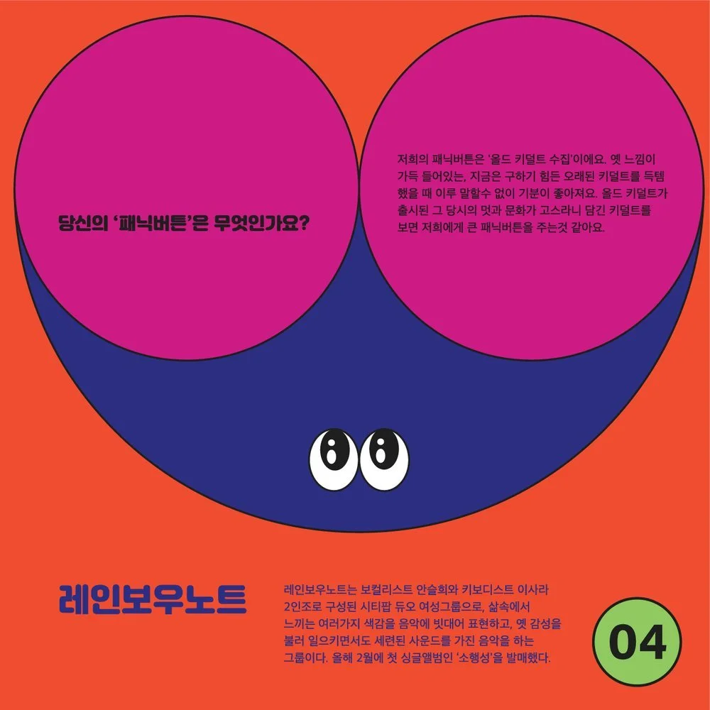
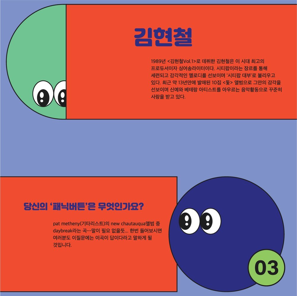
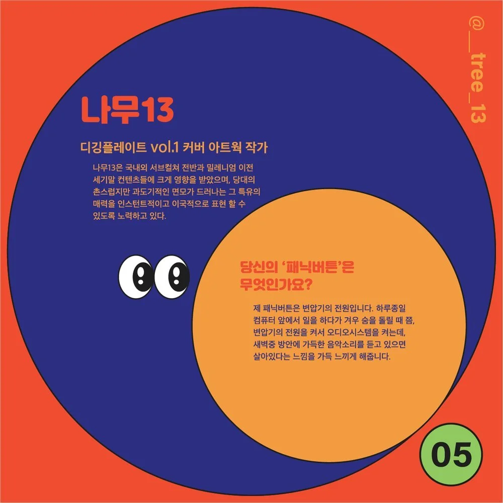
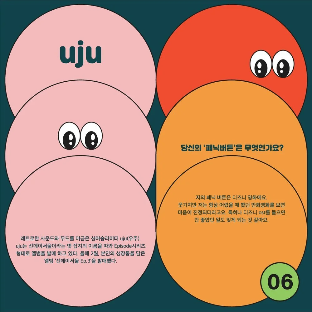
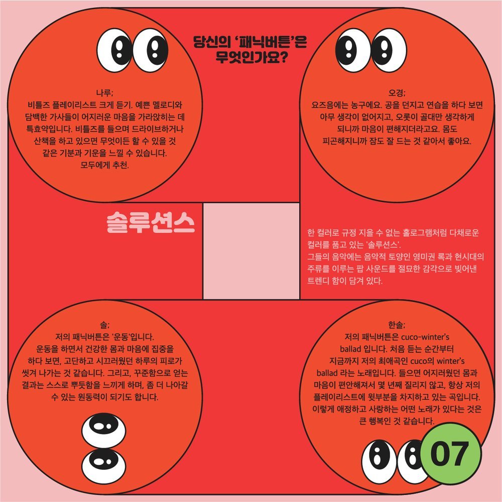
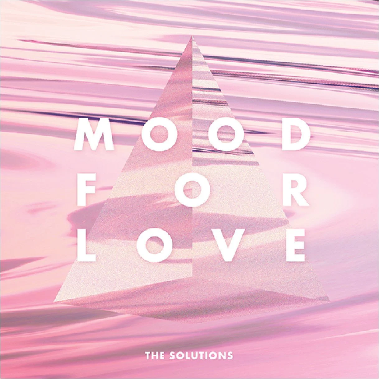
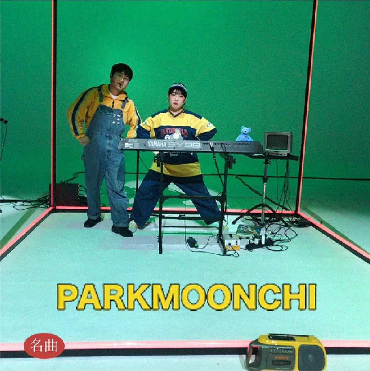
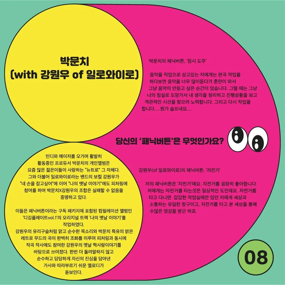
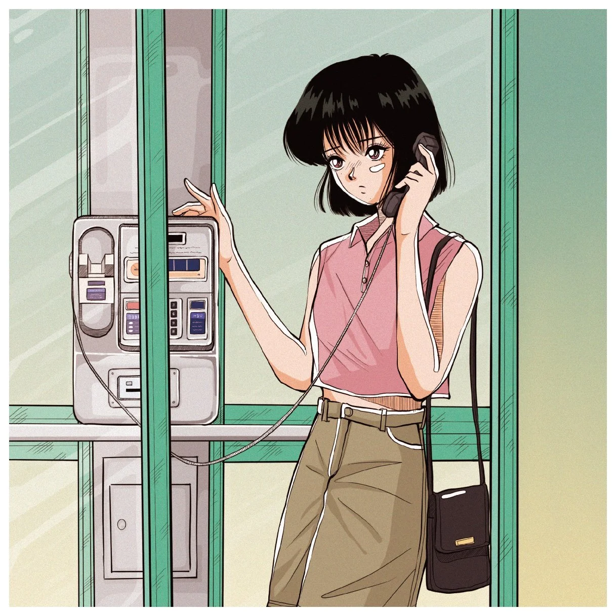
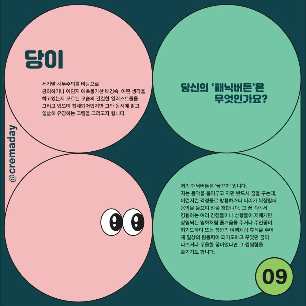
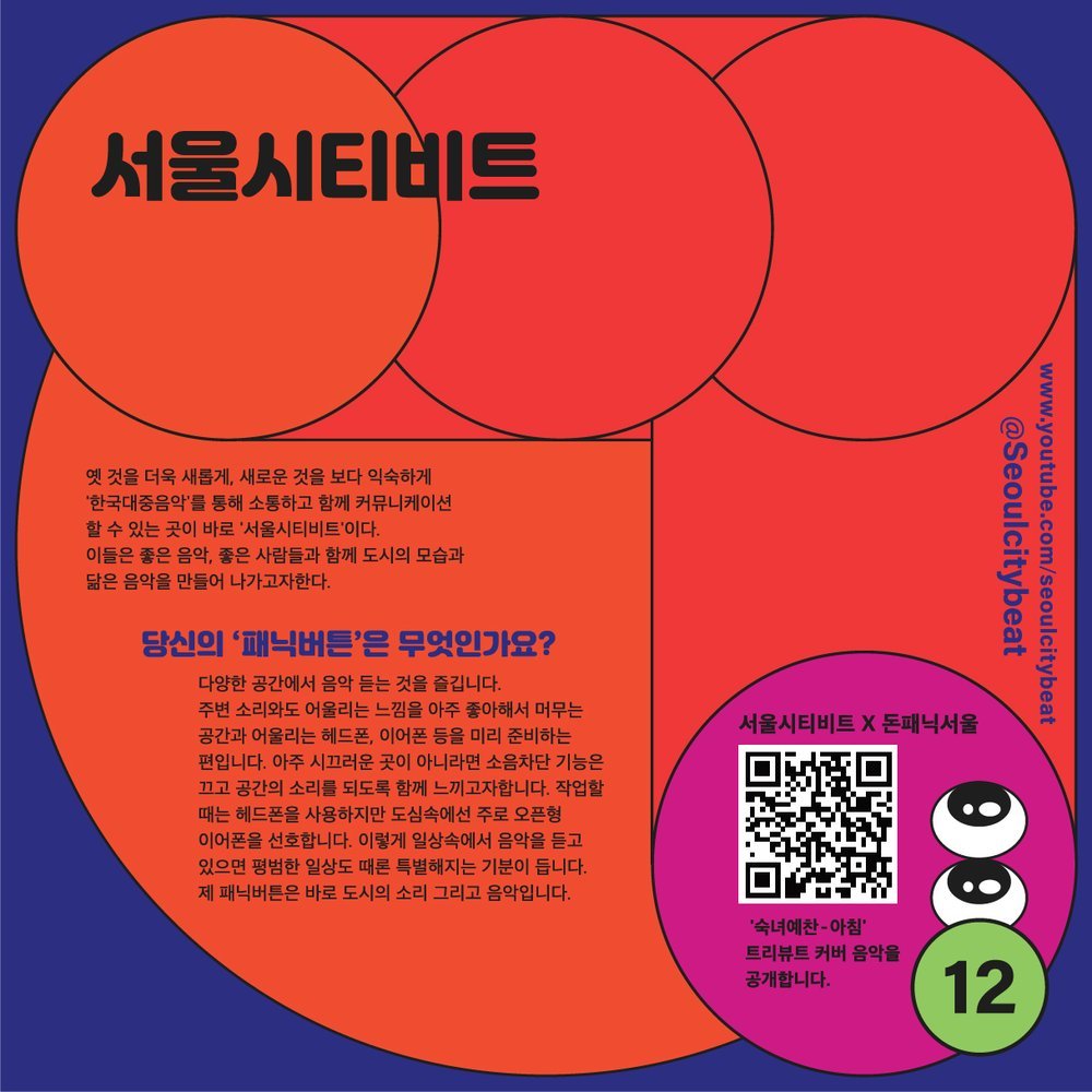
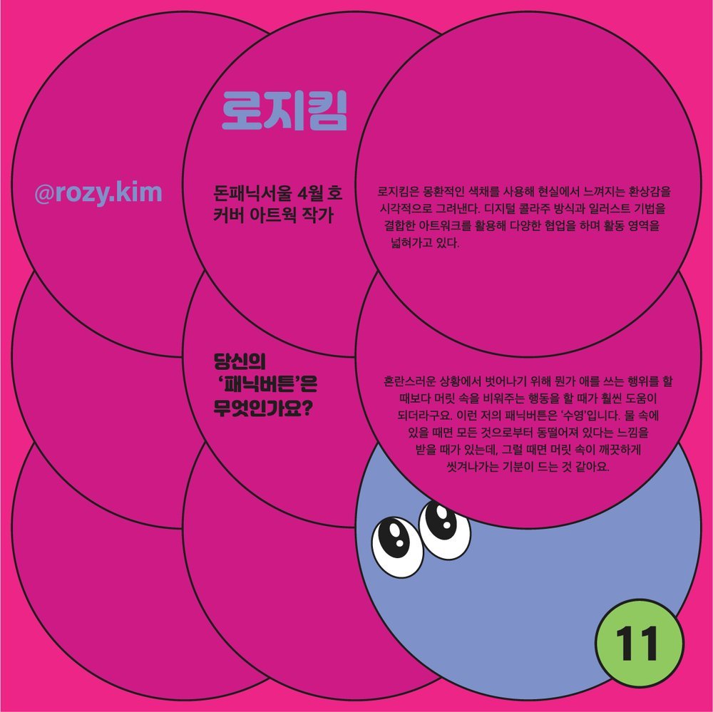
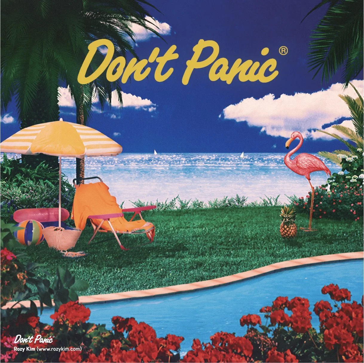
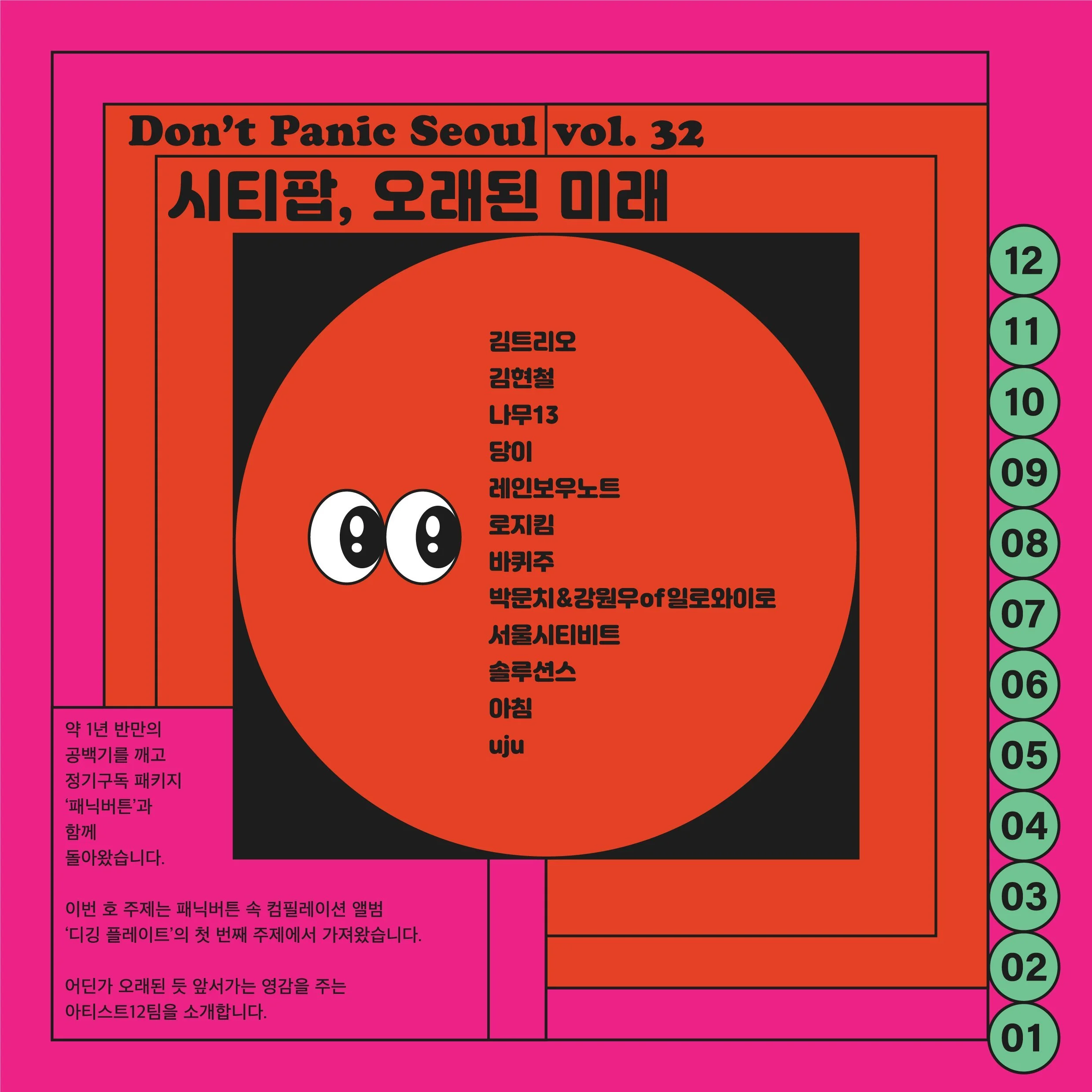
This project's core challenge was to maintain Don't Panic's strong and creative identity while visually connecting the City Pop theme and the magazine's content with musicians and artists. The magazine's unique characteristics—its square format and individual, unbound pages—were leveraged to ensure readers experienced novelty on every page.
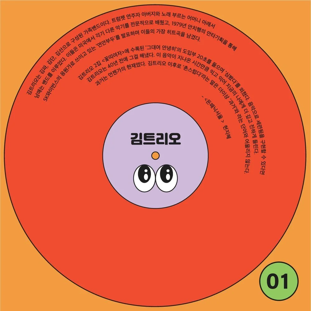
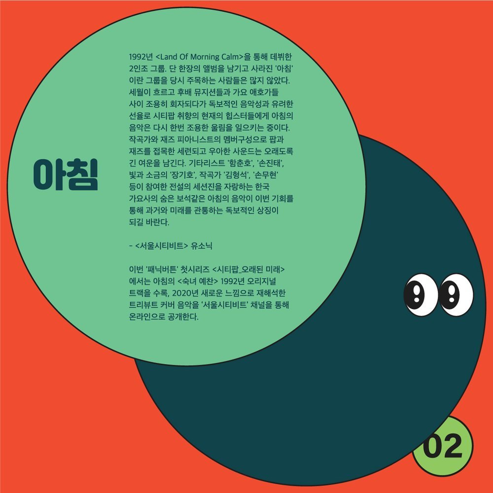
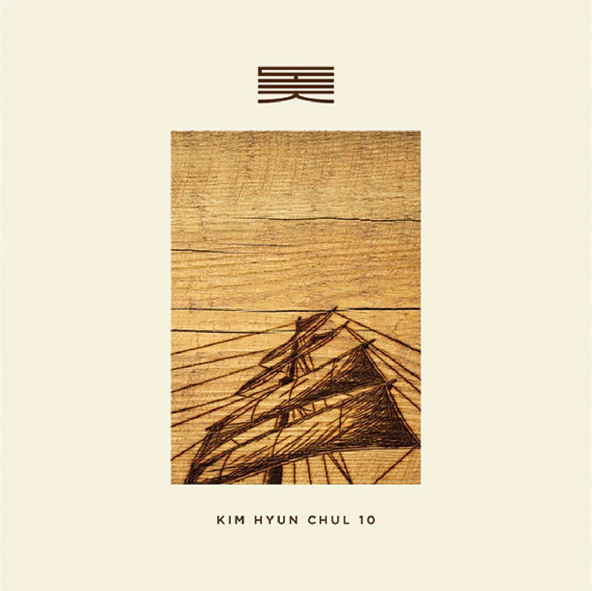
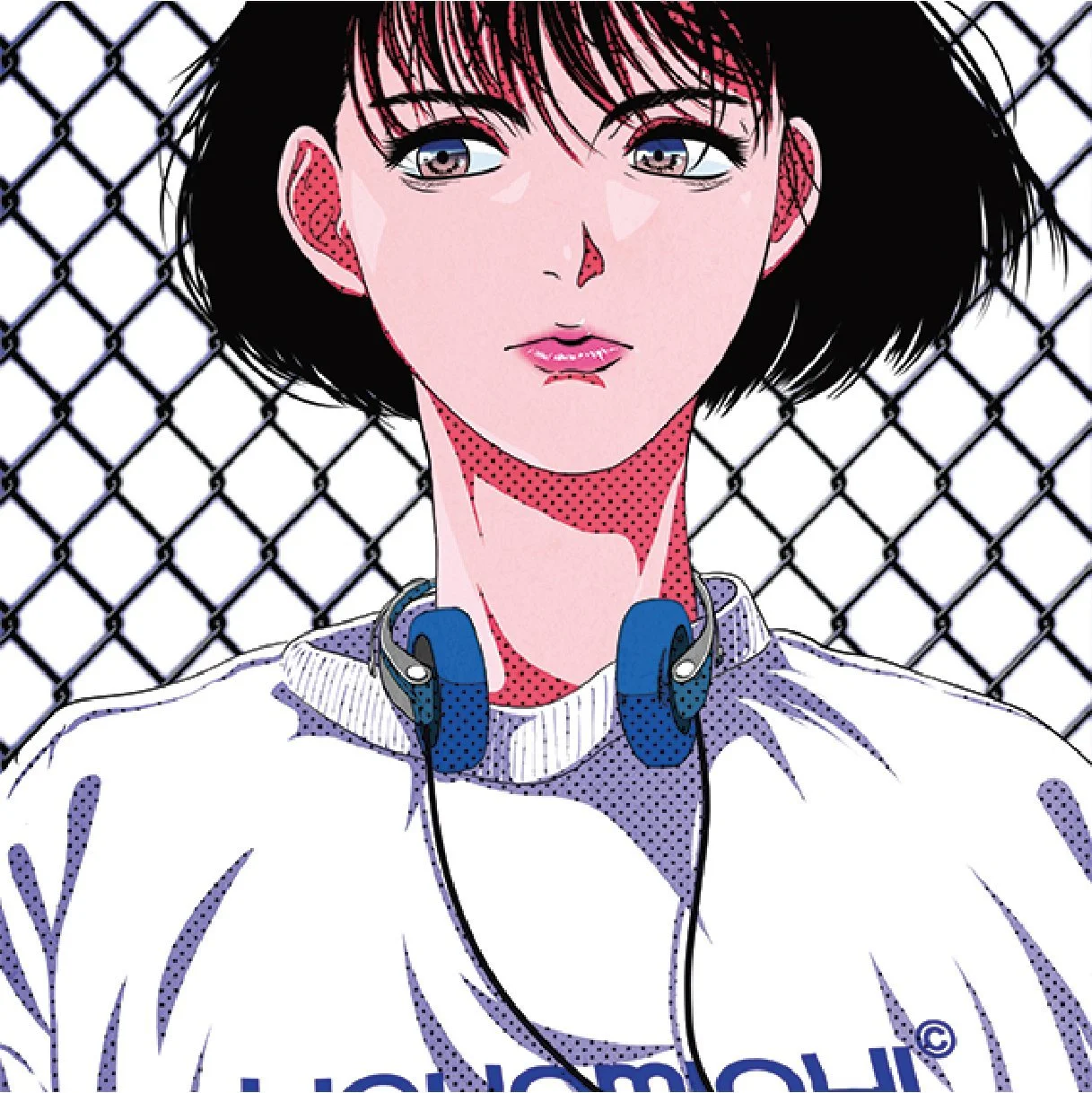
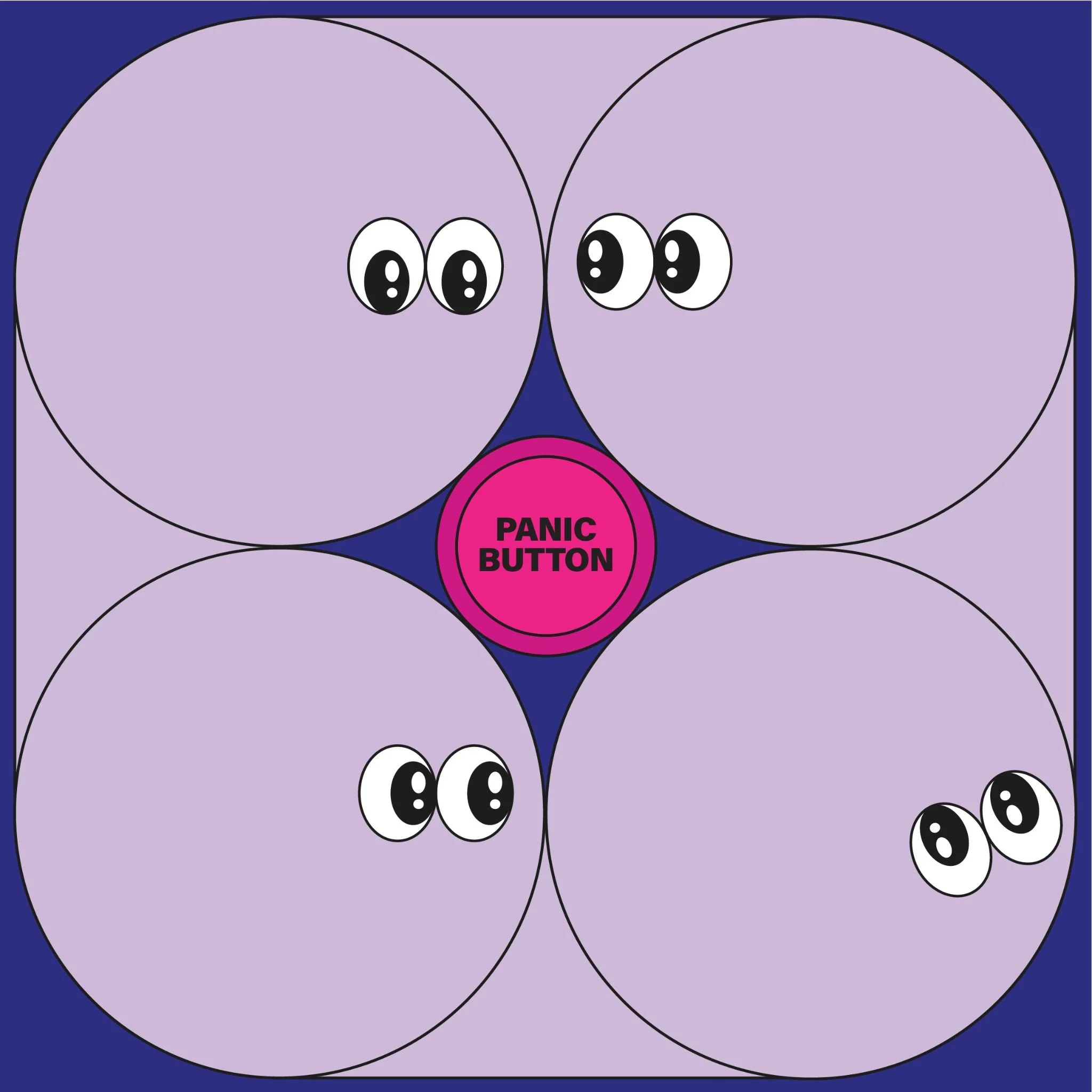
To achieve this, I designed a round character inspired by the common circular shape of LPs and CDs, using the direction of its eyes to naturally guide the reader's gaze. The character's colors were chosen to reflect Don't Panic's vibrant and creative identity, harmonizing with the album covers and artworks on the left-hand pages. By maximizing the advantages of the magazine's distinctive square format and individual page composition, I aimed to provide readers with visual enjoyment through ever-changing designs and layouts that complemented the album covers.
Through this design, readers could immerse themselves more deeply in the magazine's content, and Don't Panic's unique cultural sensibility was effectively conveyed. The continuous new design approaches successfully highlighted the freshness and creativity of this comeback issue.